.png)
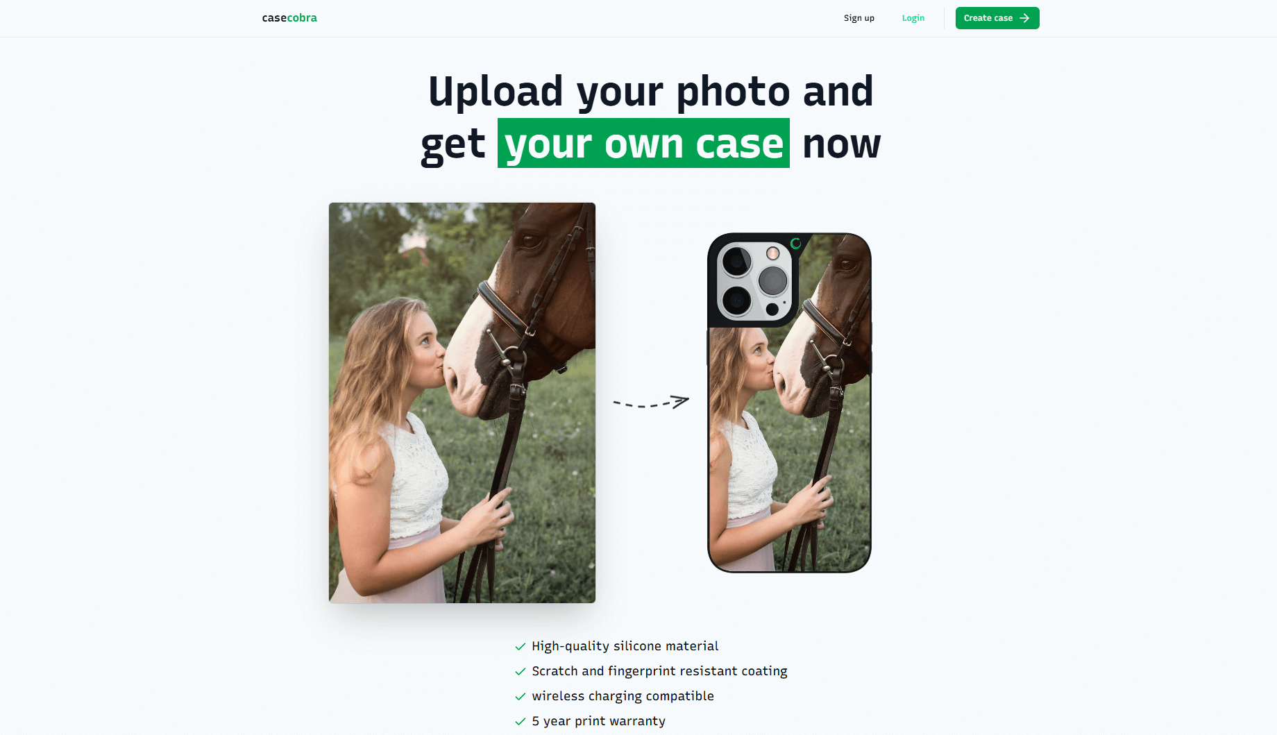
The business idea is simple just you need to upload a picture then set it on cover the website owner will print the image on the desired mobile case then send it to you.
The primary challenge was to create a website that is both visually engaging and highly usable—designed to hold a visitor’s attention and guide them through the content seamlessly. Key objectives included:
- It's not necessary to login at beginning. you can login or sign up later when you complete the process
- Ensuring the browsing experience is performant, responsive and consistent across devices (desktop, tablet, mobile).
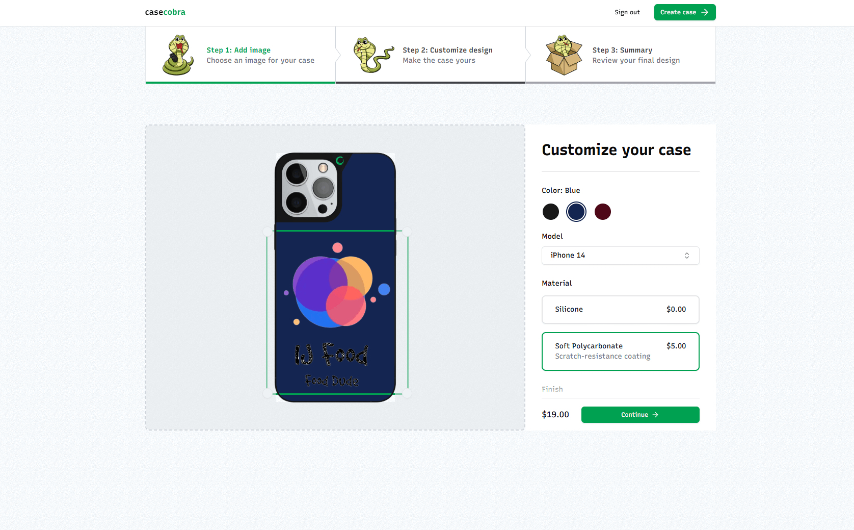
- Presenting multiple devices and case colors for the user to choose from.
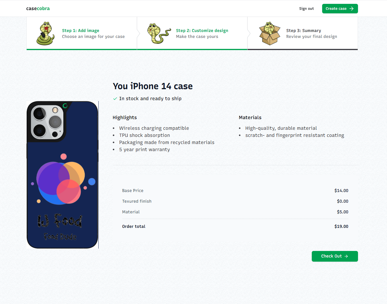
- Easy payment methods through Stripe.
The design concept centred on large typography, immersive full-screen sections and horizontal scroll/scroll-trigger patterns to create a sense of exploration. From a technical standpoint:
- NextJs/React was used for templating and structuring the site’s pages, enabling modular components and reusable layouts.
- TypeScript (vanilla or minimal libraries) powers the scroll-based animations, image manipulation libraries.
- Tailwind CSS (and possibly a framework like Bootstrap, or custom design) handles responsiveness, layout grid, typography and transitions.
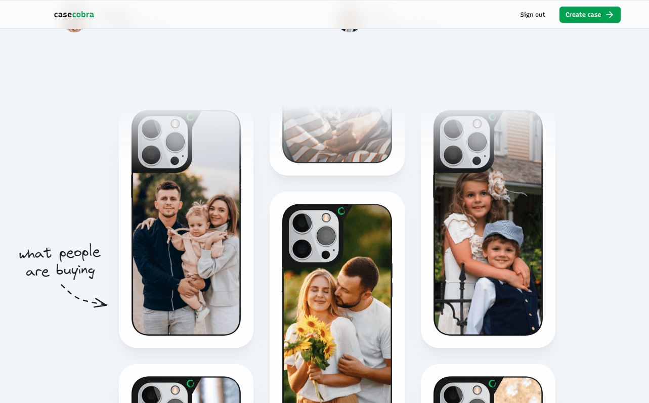
- The interactive image processing and colors are designed to make the user continue working on the website and then he can sell the case.
- Design iterations focused on performance (minimising render-blocking, optimising images), usability (clear navigation menu: Home / New case / Login / Categories / Sign up).
The end result is a fully functional, high-impact website, The site runs smoothly across devices, delivers an engaging interactive experience, and provides a scalable foundation for future updates (stores, categories). By combining minimal tech stack with strong interaction design, the project demonstrates how a front-end architecture built with NextJs/ReactJs, and TypeScript can deliver a premium digital directory solution for a real-world commercial environment.